LiftKit
The universal design system for clean, modern UI's
More than just a box of prefab components
LiftKit lays the groundwork for a strong design foundation. You won't find hundreds of random components here. Instead, LiftKit merely lets you skip the boring stuff, empowering you to build your way.
A comprehensive design system for building clean, modern interfaces
Chainlift's utility classes guarantee everything—every width, every font size, and every border radius—is scaled in perfect proportion to everything else. You'll have to really go out of your way to make it look bad.
Easier to learn, use, and customize than anything you've tried before
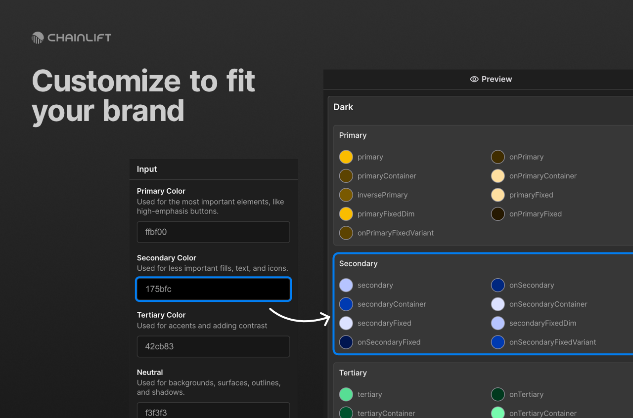
Utility classes have never been this easy. And with Chainlift Color, you can easily swap your entire color scheme in a matter of seconds, making it the perfect solution for agencies or high-volume freelancers
In LiftKit, spacing uses utility classes to give designers the flexibility to assign spacing based on each use case. By leveraging balanced scaling derived from golden ratio coefficients, the spacing system guarantees that every element, gap, margin, or padding on a page is truly proportional to every other.
Margin
Margins are by far the most heavily-used spacing class in LiftKit. They range from __xxs to__xxl.
margin-top
margin-right
margin-bottom
margin-left
Padding
padding-top
padding-right
padding-bottom
padding-left
Gaps
Gaps can be applied as combo classes to elements with display set to either flex or grid.
Standard Styles
The standard styles use light-to-medium weights (except for Heading) and give interfaces a light, airy feel.
| Style | Weight | Size (em) | Line Height | Letter Spacing (em) |
|---|---|---|---|---|
| Display 1 | 400 | 4.235 | 1.129 | -0.022 |
| Display 2 | 400 | 2.618 | 1.272 | -0.022 |
| Title1 | 400 | 2.058 | 1.272 | -0.022 |
| Title2 | 400 | 1.618 | 1.272 | -0.02 |
| Title3 | 400 | 1.272 | 1.272 | -0.017 |
| Heading | 600 | 1.129 | 1.272 | -0.014 |
| Subheading | 400 | 0.885 | 1.272 | -0.007 |
| Body | 400 | 1 | 1.618 | -0.011 |
| Callout | 400 | 0.943 | 1.272 | -0.009 |
| Label | 500 | 0.835 | 1.272 | -0.004 |
| Caption | 400 | 0.786 | 1.272 | -0.007 |
| Overline | 400 | 0.786 | 1.272 | 0.0618 |
Bold
| Style | Weight | Size (em) | Line Height (unitless) | Letter Spacing (em) |
|---|---|---|---|---|
| Display1 | 700 | 4.235 | 1.129 | -0.022 |
| Display2 | 700 | 2.618 | 1.272 | -0.022 |
| Title1 | 700 | 2.058 | 1.272 | -0.022 |
| Title2 | 600 | 1.618 | 1.272 | -0.02 |
| Title3 | 600 | 1.272 | 1.272 | -0.017 |
| Heading | 700 | 1.129 | 1.272 | -0.014 |
| Subheading | 600 | 0.885 | 1.272 | -0.007 |
| Body | 600 | 1 | 1.618 | -0.011 |
| Callout | 600 | 0.943 | 1.272 | -0.009 |
| Label | 700 | 0.835 | 1.272 | -0.004 |
| Caption | 600 | 0.786 | 1.272 | -0.007 |
| Overline | 600 | 0.786 | 1.272 | 0.0618 |
Rich Text
Rich text applies the styles above to the corresponding HTML tags for each.
Heading 1
Heading 2
Heading 3
Heading 4
Heading 5
Heading 6
Lorem ipsum dolor sit amet, consectetur adipiscing elit. Suspendisse varius enim in eros elementum tristique. Duis cursus, mi quis viverra ornare, eros dolor interdum nulla, ut commodo diam libero vitae erat. Aenean faucibus nibh et justo cursus id rutrum lorem imperdiet. Nunc ut sem vitae risus tristique posuere.
Block quote
Ordered list
- Item 1
- Item 2
- Item 3
Unordered list
- Item A
- Item B
- Item C
Bold text
Emphasis
Superscript
Subscript
Text Alignment Utility Classes
These utility classes control the padding for when there's a start or end icon, or both.